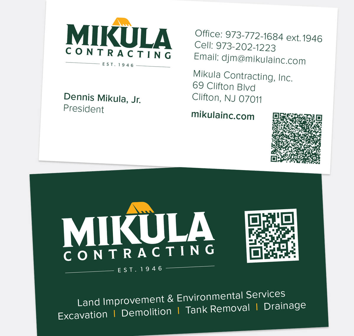
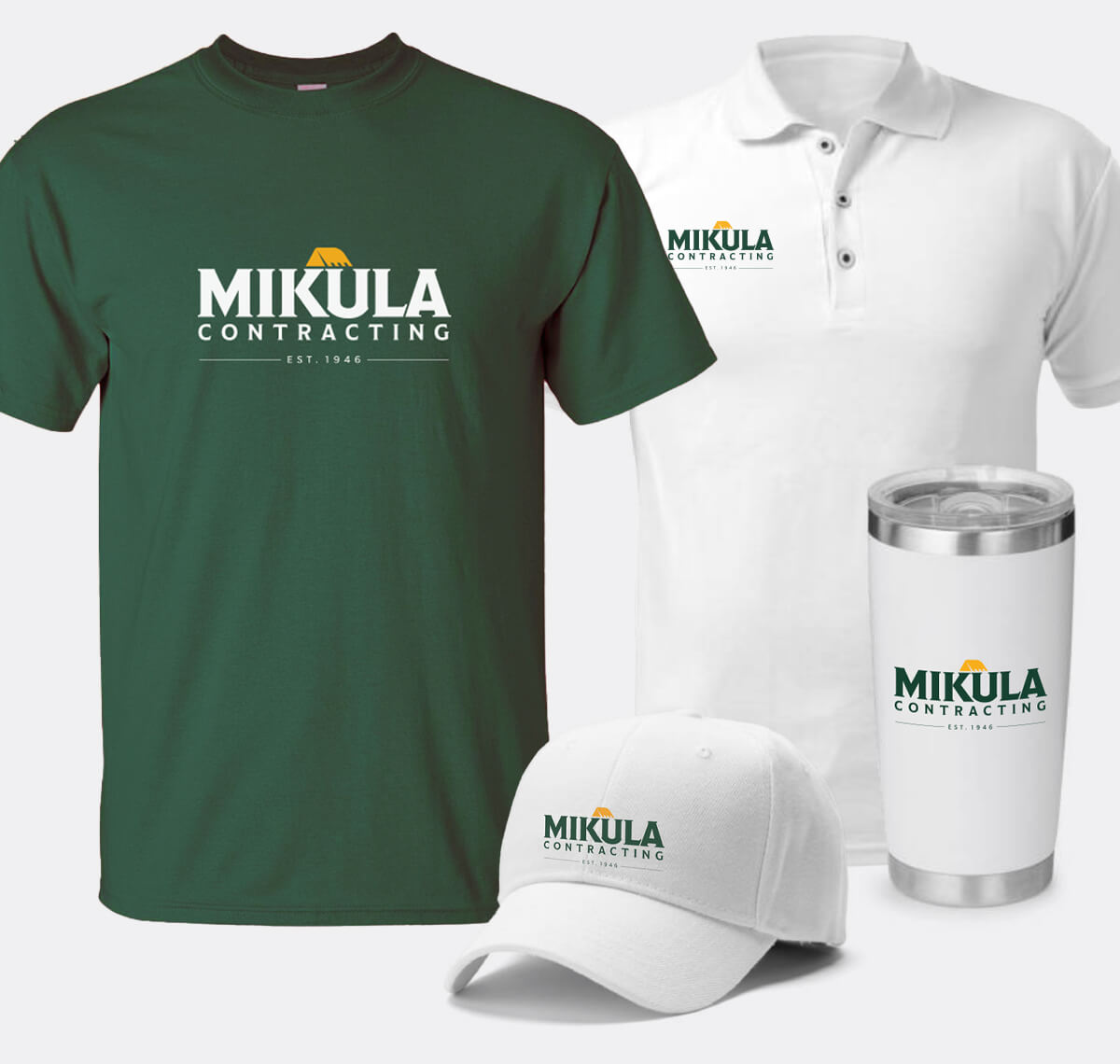
As New Jersey’s premier land improvement provider since 1946, Mikula Contracting needed more than a logo refresh—they needed a brand identity as strong and enduring as their reputation. Barnett took on the challenge of honoring Mikula’s legacy while creating a modern, versatile look that could carry the business forward.
At the heart of the refresh was a bold new logo. A key creative decision paired Mikula’s signature green with a classic construction yellow, featured on the bucket icon in their new wordmark—a combination that conveys both heritage and industry strength. From there, we developed a comprehensive brand system including usage guidelines, business cards, branded swag, and vehicle applications to ensure consistency across every digital and print application.
The result is a refreshed identity that reinforces Mikula’s credibility as a trusted, family-owned business while positioning them as an industry leader for decades to come.